Lunar Eclipse Turquoise Fringe

Measured atmospheric data, per-ray path tracing. The Moon's colors are computed from first principles.

During a total lunar eclipse, a thin turquoise fringe hugs the Moon's edge.

The standard explanation goes like this: the turquoise band comes from ozone's Chappuis absorption — ozone eats the orange-red part of sunlight, leaving blue-green light to fall on the Moon's edge and tint it turquoise. The direction is right, but two things don't add up. First, ozone absorbs orange-red roughly 100× more strongly than blue-violet. At that ratio, the transmitted light should be fiercely saturated, landing on the lunar disk as a broad band glowing with blue-green fluorescence. The actual turquoise band is so faint you barely notice it with the naked eye; without HDR stacking, most photos can't pull it out at all. Second, sunlight refracted through the ozone layer should span an angular width comparable to the Sun itself — about 32 arcminutes. The literature reports a band only two arcminutes wide. These two mismatches forced us to put down the camera and open a terminal. Using measured atmospheric profile data, we traced millions of rays skimming Earth's limb — refracting, scattering, and absorbing each one individually — and computed the band out of raw physics. We got it wrong more than once. Each failure revealed a piece of physics we had been missing. Once the model converged, it also had a capability no photograph can offer: toggle ozone off in simulation and see whether the band survives.

−15 stopsBrightness of the deepest umbra relative to the uneclipsed full Moon (photopic passband; default physics passband includes background aerosol).
R/B 0.81Red-to-blue ratio at the band's bluest point (raw sRGB passband, at 41′): a faint cyan cast, nowhere near saturated blue.
32′ vs. 4′Solar angular diameter vs. turquoise band angular width: a 32-arcminute solar disk smears what would have been a deeply saturated turquoise swath into a pale cyan fringe barely 4 arcminutes wide.
Ray-traced render of an eclipsed lunar disk: the left side sits deep in the umbra in dark coppery red, a cool grey-cyan transition band sits just left of center, and the right limb approaches the white of normal moonlight
Ray-traced rendering of the eclipsed lunar disk (lunar center 40′ from umbra center). The left side, deep in the umbra, appears coppery red; the right limb lies in the penumbra and looks close to normal moonlight; the cool, pale cyan-gray streak just left of center is the turquoise band. Every pixel color comes directly from ray-tracing computation, with no post-processing color grading applied.

Three things that run against intuition. By the time you finish this page, they'll make sense.

Ozone creates the turquoise band, but it only tells half the story.

Why is it a narrow band — why doesn't the whole inner umbra edge turn cyan?

Ozone's Chappuis absorption band eats the 500–650 nm orange-red portion of the spectrum, letting blue-green light through — that part of the explanation holds up. But it hides a quantitative contradiction. If ozone alone were at work, sunlight refracted through the stratosphere would span roughly the Sun's angular diameter, around 32 arcminutes. The literature reports a turquoise band only two arcminutes wide — over an order of magnitude narrower. The color transition across the lunar disk is actually a smooth gradient spanning more than ten arcminutes, with no sudden jump anywhere. If you looked at color alone, the entire umbral boundary would appear as a broad wash of pale cyan. The band looks razor-thin because it happens to fall on the darkest segment of the luminance curve, squeezed on both sides by far brighter regions. The Luminance Cliff section below unpacks the full mechanism.

Why does the turquoise band vanish at maximum eclipse?

The sunlight that reaches the deep umbra grazes Earth's lower atmosphere. Down there, Rayleigh scattering scales inversely with the fourth power of wavelength — blue light gets scattered away almost completely, leaving only red to penetrate through, staining the Moon a dark coppery hue. The turquoise emerges from higher up: when sunlight skims the stratosphere, Rayleigh scattering recedes into a secondary role, and ozone's Chappuis absorption takes over, stripping out the orange-red and letting blue-green through. This altitude range maps onto the Moon at the umbral boundary, not the center. At maximum eclipse, the entire lunar disk is bathed in Rayleigh's red zone; ozone's cyan simply doesn't reach it. The turquoise band only appears once the Moon starts drifting outward and the umbral edge draws near.

Why are lunar eclipse photos online so much more saturated in blue?

Satellite-measured R/B ratios fall between 0.8 and 1.0 — an extremely subtle cool cast, nearly invisible to the naked eye. Those online photos showing half the disk drenched in saturated blue are built from HDR stacks merging multiple exposures, followed by aggressively pushing the cyan channel's saturation in an HSL panel. The physics side has clear numbers too: ozone absorbs orange-red roughly 100× more strongly than blue-violet. If the Sun were a point source, the computed band would indeed be deep and sharp, with R/B dropping as low as 0.41. But the Sun is a 32-arcminute disk, and that angular extent smears the deep cyan out — in the end, R/B settles to 0.71, matching real observations. The vivid blues you see online come from post-processing and from an idealized point-source world that doesn't actually exist. The next section runs through the reconciliation.

First crash: using viral photos as ground truth

That saturated-blue-half-disk look — no matter what we tried, our model wouldn't produce it.

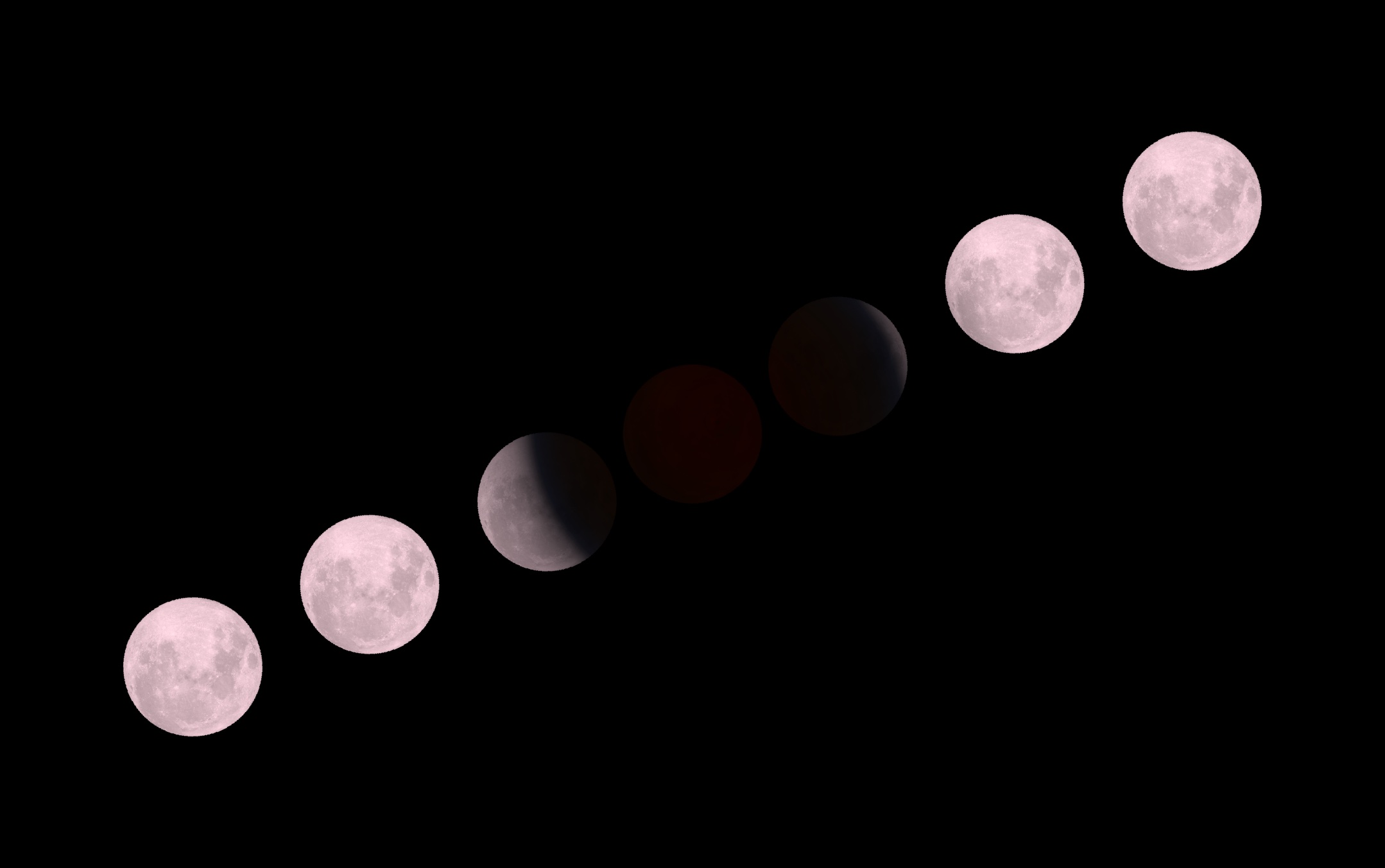
Halfway through the project, we fixated on a widely circulated photo of the lunar eclipse blue band: half the disk submerged in deep, saturated blue. Using that image as reference, we ran the model over and over — it stubbornly produced only a faint cyan tint. For a stretch, we genuinely suspected we were missing some physical mechanism. Eventually we traced the photo back. The author runs a landscape-photography post-processing tutorial channel; the post title itself describes the editing workflow: HDR stack multiple exposures, then drag the cyan channel's saturation in HSL until it approaches neon. The same author has also noted that this blue is nearly imperceptible to the naked eye — you need HDR to excavate those colors buried in the shadows.

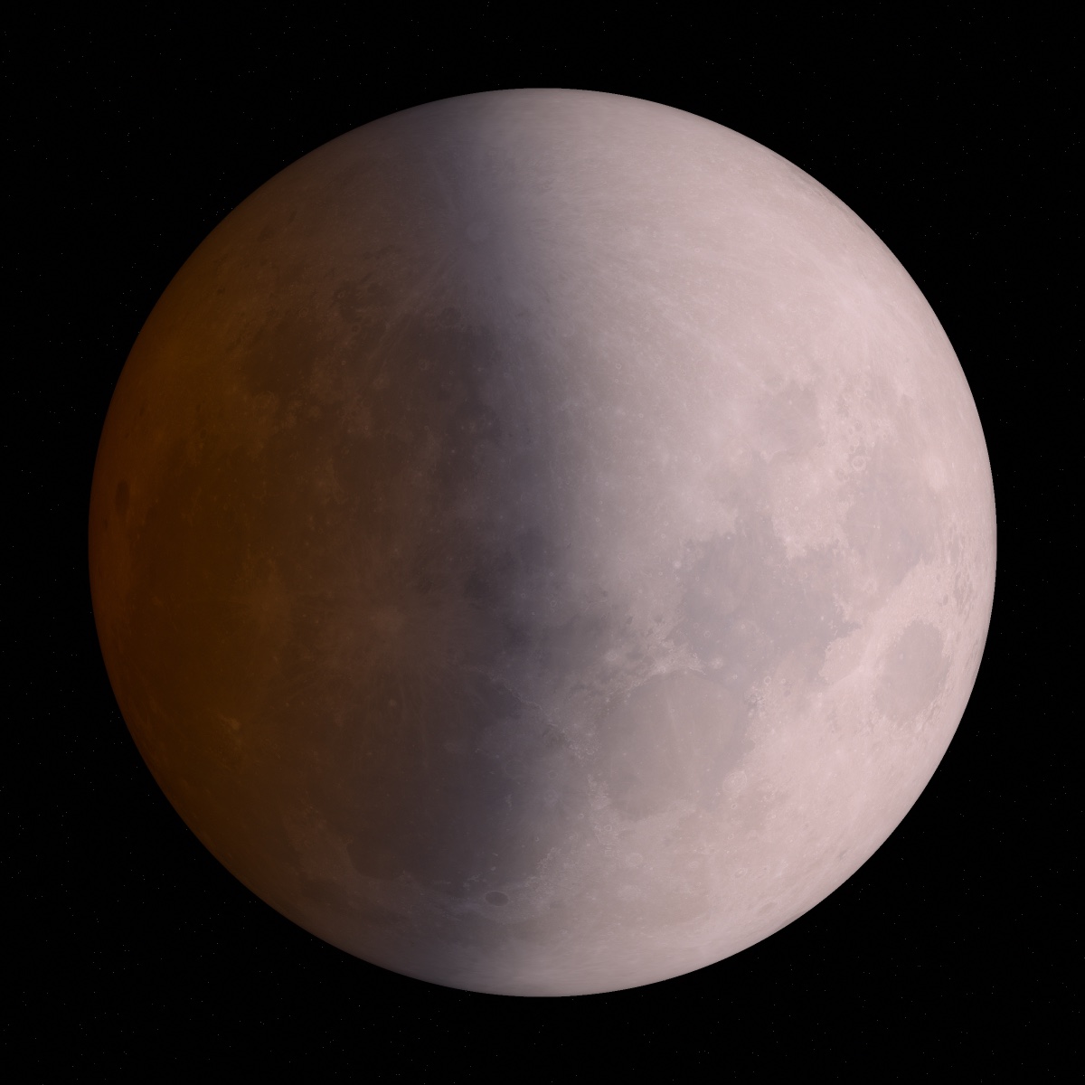
The physics pointed in a different direction. GOES-16 meteorological satellite measurements during lunar eclipses give R/B ratios in the 0.8–1.0 range. In unprocessed raw frames from professional astrophotography, the blue band appears as nothing more than a faint cyan line hugging the Moon's edge. We never tweaked any physical parameter to nudge our results toward that viral image, and piece by piece, the measured data lined up.

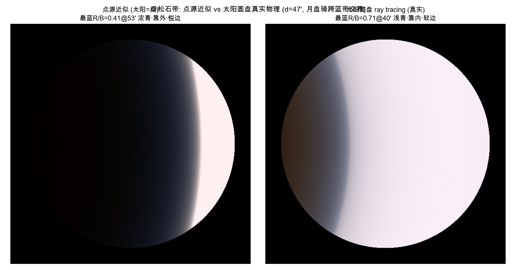
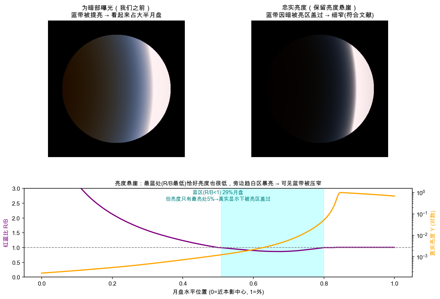
What's interesting is that our own model did produce a deeply saturated cyan — under the right conditions. When we treated the Sun as a point source — a simplification, obviously — the model spat out a band that was vivid and sharp, with R/B at the bluest point dropping as low as 0.41. This kind of simplification actually has precedent in the literature. A common approach for handling the extended solar disk is to first derive the full formalism under a point-source approximation, then apply a geometric compensation afterward. Mallama 2022's review of lunar eclipse modeling adopts the "for a point source of light" assumption, deriving refraction formulas in the point-source framework and then applying a blurring correction. I adapted that method to our scenario — and the results were off. The computed umbral brightness differed from observations by several orders of magnitude.

In the end we abandoned the approximation route and went back to the brute-force approach: no closed-form derivation, no geometric compensation patch. Instead, we performed multiple integration over all points on the solar disk. Sample many points, simulate many rays, and trace refraction, scattering, and absorption independently for each one. Once the multiple integration ran through, the deep cyan immediately diluted — R/B retreated from 0.41 to 0.71, the tint softened, the band widened and blurred, and its position shifted inward. That's what a real lunar eclipse actually looks like. The saturated blue in those viral images really does exist — in a point-source world. But our Sun is a 32-arcminute disk, and it doesn't play along.

The human visual system adds another layer. The absolute chromaticity of this band leans blue: no matter how you tune the model — remove Rayleigh scattering, add aerosol, simulate multiple-scattering backfill — it never shifts toward cyan-green. People perceive it as cyan or greenish because it sits right next to a vast expanse of warm red blood-moon. After the human visual system adapts chromatically to that warm backdrop, this comparatively cool band registers as turquoise-green. Turquoise is a relative color. We did not insert any extra mechanism into the model to make it green in an absolute sense.

Two lunar disks compared: left shows the point-source approximation with a dense, sharp cyan band; right shows the real solar-disk physics with a faint, soft-edged pale cyan band
Left: Sun treated as a point source, R/B at bluest point = 0.41 (at 52.6′), deep cyan with a sharp, well-defined boundary. Right: ray tracing with a 32′ solar disk, R/B = 0.71 (at 40.4′), pale cyan with a soft edge. Passband: linear sRGB R/B ratio; molecular atmosphere conditions (no aerosol added). Both images shown with enhanced contrast for presentation.

Core experiment · each step adds exactly one physical mechanism

Six steps, peeling back every layer of the turquoise band.

The starting point is a plain gray disk with nothing on it. Each step forward adds one real physical mechanism to the model, showing how the lunar disk transforms from a fake full Moon into what you'd see during an eclipse. This step-by-step toggle system has a feature no camera can offer: counterfactual attribution. Step 4 adds ozone — the turquoise band appears immediately. Step back to Step 3, which is equivalent to switching ozone off, and the band vanishes. Only computation can deliver that kind of causal confirmation. All six images use the same contrast-enhancement parameters so you can compare differences across steps clearly; the faithful-exposure-rendered version is in the Luminance Cliff section.

Step 1: A gray disk

↓ Click any step to update the display on the right

Step 1: a grayish-white full-Moon disk with lunar mare texture

Same physics, different vantage point

Standing on the Moon and looking back at Earth — it's a total solar eclipse.

During a total lunar eclipse, if you look toward Earth from the lunar surface, Earth's nightside completely blocks the Sun, leaving only a ring of atmosphere-lit glow around the planet's edge. These two perspectives are two expressions of the same radiative-transfer physics: the color at any point on the lunar surface equals the color of the corresponding point on Earth's atmospheric ring, as seen from that spot on the Moon. The ring transitions from red on the inner edge to cyan to white on the outer edge — it's essentially the color profile of a sunset unrolled into a full circle. The turquoise band on the Moon's edge corresponds to a small cyan segment on the sunward side of the atmospheric ring, at stratospheric altitude. Once the simulation pipeline was running, switching the integration dimension automatically yielded the lunar perspective — we wrote no new code specifically for this view. We simply flipped the same physics from the Earth side to the Moon side.

Four-panel view of the Moon traversing the umbra

The video tracks the lunar center from 10′ to 60′ from the umbra center. The first panel (top left) shows the lunar disk, starting from the bronze blood-moon in the deepest shadow, crossing the terminator, and entering the bright white penumbra. The second panel (top right) shows what you'd see from the Moon looking back at Earth: Earth's nightside blocks the Sun, and the illuminated segment of the atmospheric ring rotates with the changing relative geometry — the moment the Moon exits the umbra exactly coincides with the diamond-ring effect as the Sun peeks out from behind Earth's limb. The third panel (bottom left) provides a telephoto close-up of the atmospheric ring; its true thickness is only about 1.3% of Earth's angular diameter, so the panel scales it up for visibility. The fourth panel (bottom right) explains the spectral origin of the turquoise band: how Rayleigh scattering, ozone Chappuis absorption, and transmission windows shift as sunlight's grazing altitude changes. The video has no audio.

Artistic composite of a lunar eclipse trajectory: the Moon traces a diagonal path across the frame, going from full-Moon white through grey-cyan and deep coppery red and back to full-Moon white
A single image compressing the entire lunar eclipse: the Moon moves along its orbit through Earth's umbra, passing through the turquoise band once on entry and once on exit. This is an artistic composite — composition and tonal balance involve deliberate choices, and the luminance relationships have been compressed. Do not treat this as photometric data.

The decisive crash

The band looks narrow because of luminance.

For a long time we obsessed over the band's width in color space. The literature says it occupies only a few percent of the lunar disk diameter; our renders were spreading it across nearly a third of the disk. We kept double-checking ozone parameters, geometry, color science. Eventually we realized the failure was in exposure. The early renders artificially boosted the entire umbra to make the dark regions visible. The blue region was already very dark — crank up the brightness, and it sprawls into a broad gradient. That wasn't a physics error. It was a display artifact.

The real mechanism is a luminance cliff. Color (R/B ratio) transitions smoothly across the lunar disk, spanning more than ten arcminutes with no abrupt jump. But the bluest segment also happens to be the darkest point on the entire curve — its luminance is only a few percent of the brightest part of the disk. The eye can't see it. And it's hemmed in on the other side by normal moonlight just outside the umbra, which is 250× brighter, completely washing out the cyan with intense white light. In the model card's passband, photopic surface brightness climbs from 10% to 90% of full-Moon level over a mere 20.4′ of angular distance (from 46.7′ to 67.1′). At the steepest part of the umbral boundary, brightness changes at 1.8 stops per arcminute. The turquoise band you can actually see is the narrow intersection satisfying both conditions — blue enough and bright enough — squeezed into a thin slit by this cliff. The color gradient is smooth, with no jump; the visual result is a sharp, well-defined band. These two statements are not contradictory. The turquoise band can't be too dark, can't be too bright, and has to be blue enough. Those three constraints visually compress it into a narrow ribbon.

This crash left two lessons. First, exposure and tone-mapping choices have the power to completely mislead your judgment about physical mechanisms: when a render looks wrong, decompose it — figure out whether the physics itself is wrong or the display strategy is lying to you. Second, the answer to "why is there no turquoise band at maximum eclipse" also lives on this luminance curve: the deep umbra is over a dozen stops darker than the full Moon, and the sunlight's grazing altitude is too low for ozone to play a role. Cyan exists only in the narrow slit at the edge of the luminance cliff. At maximum eclipse, the Moon is squarely in the center of the umbra — nowhere near that cliff.

Two exposure strategies compared: exposing for the shadows makes the blue band appear to cover most of the disk; faithful exposure narrows it to a thin ribbon; curves below show the red-blue ratio and luminance along the lunar disk
Same physical model, two exposure strategies. Left: exposure compensated for shadows; the blue region is brightened and appears broad. Right: faithful-exposure version, exposed for the brightest part of the lunar disk; the blue band, being dark itself, is squeezed by the surrounding bright zones into a narrow ribbon, consistent with the literature and real photographs. Lower curves: R/B ratio (purple) shows a smooth gradient; luminance (orange) dips to its minimum exactly where the band sits. Click image to view full resolution in a new tab.
Lunar eclipse photometric profile: from about −15.5 stops at the umbral center, climbing gently, then steeply near 41 arcminutes, reaching full-Moon 0 stops at 73 arcminutes
Ray-traced luminance cross-section (uneclipsed full Moon = 0 stops reference). Inside the umbra, a gentle slope of refracted light; near the umbral boundary around 41′, a steep climb; within the penumbra, direct sunlight gradually returns, smoothly approaching full-Moon brightness by 73′. Curve computed from 16 million rays with stratified sampling; the center reads −15.5 stops. The model card baseline run (4 million rays) gives −15.1 stops at center; the difference is attributable to statistical fluctuation across a few annuli near the center. Click image to view full resolution in a new tab.

What lines up, and what doesn't

Everything that checks out, and everything that doesn't — all on the table.

Three things check out. First, the computed refraction geometry, in the mid-to-high grazing-altitude range where the band lives, deviates by less than 2% from the tabulated values in Mallama 2021. Second, the R/B ratio at the band's bluest point falls in the same order of magnitude as satellite measurements — both in the 0.8–1.0 pale-cyan range (measurement passbands differ between the two; a rigorous per-item reconciliation is recorded in the second open item). Third, the band hugs the umbral boundary, appears pale cyan, and is narrow — consistent with what unprocessed raw frames from professional astrophotography show.

The first mismatch is at the dark end. Our model gives an umbra center of roughly −15 stops, a figure built on the clearest-sky assumption, with climatological-mean background aerosol added (pure molecular atmosphere with zero aerosol yields a theoretical ceiling of −13.5 stops). Mallama's clear-sky empirical extinction model produces an umbra center between −18.7 stops (disk-integrated) and −20.5 stops (disk-resolved V-band). Both models claim "clear-sky," yet their results differ by several stops. One root cause: the precise definition of clear-sky diverges. Grazing sunlight travels slant paths through Earth's atmosphere equivalent to 40–60 airmasses; even minuscule differences in background aerosol assumptions get multiplied enormously by that factor. Resolving this disagreement remains an open item.

The second mismatch concerns satellite narrowband measurement passbands. Shu 2024, using the GF-4 satellite, captured a narrow band (ribbon) at the umbral boundary with R/B < 1, with a full radial width of 120–190 km. We recomputed under the same passband and could not reproduce this ribbon: a single physical layer can indeed produce a narrow dip, but it gets erased by the convolution effect of the 32′ solar disk and by red light bleeding in from the deep umbra. We performed sensitivity analysis, ruling out aerosol parameters and deep-red bleed as the culprits. The strongest candidate explanation at present is missing extinction in the red shoulder band at tangent altitudes of 8–19 km — possibly from thin cirrus near the tropopause. Our model does not include this layer, and the actual cloud conditions on the night of that eclipse are no longer retrievable. Three additional passband discrepancies exist: differences in satellite spectral response, ±15% variability in lunar surface albedo, and the asymmetry between a 2D boundary measurement and a 1D radial average. Any one of these three, taken alone, is enough to flip the verdict.

The third item is a negative boundary the model explicitly declares: it cannot predict whether the next lunar eclipse will look bright or dark. That depends on stratospheric aerosol conditions at eclipse time — a total lunar eclipse following a major volcanic eruption can be several stops darker than one during a quiet year. The model provides the physical mechanisms and their brightness floor under the clearest conditions. It is not a forecasting tool.

For those who want to go deeper

How were these images actually computed?

None of these images rely on texture-map color grading, and no phenomenological fitting parameters were injected. Refraction is computed via per-ray numerical integration; extinction is accumulated along each curved path using measured cross-section data; focusing and defocusing emerge naturally from the spatial density of millions of ray landing points on the lunar disk. The deep-dive page walks through six key technical decisions, reconciliation against three sets of literature values, the critical numbers on the model card, and the reproducible commands for every image.

For those who want to get their hands dirty

The entire project is open source. You can reproduce it on your own machine.

The code, download scripts for measured data, and all parameters are in the repository. You can re-render every image and video on this page. You can also flip each physics switch back and forth and run your own counterfactual experiments — for example, swap in ozone column amounts from a different season and watch how the band's color shifts.

Open GitHub Repository